Semi-Permanent Submission
Posted: Wednesday,22nd July, 2009 Filed under: digital illustration, graphic design, photography, recycling, typography | Tags: conversion, graphic design, illustrator, layers, original, photography, photoshop, poster, recycling, remake, semi-permanent, submission, typography, vector illustration 2 Comments17th July 2009
SEMI-PERMANENT SUBMISSION
After being inspired by the first 2009 semi-permanent book that DesignIsKinky released I have submitted five artworks to hopefully get included. The following quote is the email I sent them.
“Hello
I really loved the first 2009 book and it inspired me to want to be included in a next book, hence here now is my submission. Attached is my 5 submissions for the second 2009 book, all to specified sizes. Three files are saved as 72ppi jpg. The gif file shows a stroked line which is the bounding box the rest is there as a 5mm bleed. I feel as though I must mention the last file: it is just a jpg but the actual design has been printed A1, mounted and exhibited at the University of the Sunshine Coast Art Gallery in June-July 2009 (student exhibit) and will also be exhibited in a different show in Gympie in October.My name is: Kassandra Bowers
Website: https://kassandradesigns.wordpress.comThanks for looking at my designs.”
#1

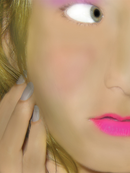
Air Brush of myself - I am aiming for doll like
This is me having a go at air brushing to the extreme but keeping in touch with reality. I have added nail polish, eye shadow and lipstick. This contains an skin texture brush from keepwaiting.
#2

a photograph with a caption saying its unedited
This is a photograph of a flower that has been composed so that the pollen is on the top left hand rule of third intersection. The image is unedited except the text stating it is Fig 1 and that it is unedited. The camera lens is literally inside the flower.
#3

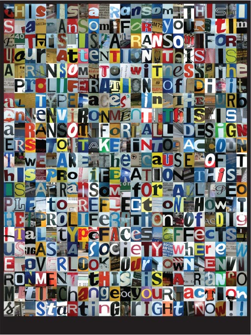
"Proliferation of Digital Typeface in the Urban Environment"
This is my final A1 poster for ADN214: Visual Identity and Exhibition Design. There is more information about it at this page: Urban Typography by Kassandra Bowers. This is the submission mentioned earlier as being exhibited in an art gallery.
#4

FINAL: something for semi permanent
This is something that I created especially for the book (the other things are all adapted from somewhere else). The stuff outside of the stroked line is the bleed. The fun thing about keeping a blog is seeing things connect as: something for semi-permanent has already been changed since its original blog entry.
#5

commercialism's younger brother: development (ISM back cover)
This was the back cover for the ISM (Independent Student Magazine from the University of the Sunshine Coast) I worked on page layout and graphic design for the COMMERCIALISM issue. This was the back cover that I made from photographs I took in 2005. I was surprised after I got back to the Sunshine Coast after being in Darwin for 13 months to find that these patches of grass are now covered in concrete and structures. This has been edited since the original back cover. I sadly didn’t pick up on a typo and 10 000 copies were sent out with the 2005 saying 2008 (which didn’t make sense and was picked up on by a few of my university friends).
Urban Typography
Posted: Wednesday,22nd July, 2009 Filed under: graphic design, photography, typography | Tags: compile, exhibited, graphic design, illustrator, layout, photography, photoshop, project, screenshot, semi-permanent, urban 2 Comments13th May 2009
PROLIFERATION OF DIGITAL TYPEFACE IN THE URBAN ENVIRONMENT
A1 Major Assessment for ADN214 (Visual Identity and Exhibition Design) which focuses on either photography or digital illustration to represent the concept: technology’s affect on society/the human condition.

"Proliferation of Digital Typeface in the Urban Environment"
INSPIRATION
This all came about after seeing and photographing this particular scene:

The inspiration for the urban typography poster
I was on a Sunshine Coast train and I could not help but notice how many signs were in such a small place. All are from digital origins too. This made me think about digital typography and its affect on society. Then I started to research into the various areas:
- urban environment = human condition/technology
- digital type = technology
- movable type = technology
- photography = technology
- desktop publishing = technology
- time and space = human condition
- pattern recognition = human condition
- attention span = human condition
Some of the good bits that I found:
“For good or ill, Helvetica’s geometric forms litter the urban environment so densely that most of us barely notice them.”
King, E. 2007. Love Letters. Frieze. Iss. 107. Frieze, London.
“Design is everywhere. But if you live in a crowded urban environment, you are absolutely surrounded by it. Much of it may go unnoticed. Just paying attention to the ubiquitous samples of graphic design — for example posters, banners, billboards, etc. — Could fill every waking moment of your day.”
web reference“Digital photography is to analogue photography what photography was to painting in the 1840’s. It is a process in which artists seek to establish the new medium’s definitions while acknowledging the
aesthetic dominance of an established art form.”
Halick, D. 1990. The Transcendental Machine? Leonardo. Vol 23. No 4. Pergamon Press, Great Britain.“Feature Integration Theory (FIT) attempts to understand how visual attention binds (glues) separate features of individual objects together. FIT assumes a known visual system where colour, orientation and size are coded automatically without need for focal attention.”
Styles, E. 2005. Attention, Perception and Memory. Psychology Press, East Sussex.
This may seem like an insane amount of research but the overall presentation that I showed to the class on the 22nd of April 2009. The presentation was constructed in InDesign and exported as a PDF it ended up being 47 pages long. Here is the full list of references used:
BOOKS:
ABS, 2001. 1216.0 – Australian Standard Geographical Classification (ASGC)
Currie, N. Long, A. 2006. Foto.Log Book. Thames and Hudson, UK.
Drucker, J. 1984. Letter Press Language: Typography as a Medium for the Visual Representation of Language. Leonardo. Vol 17. No 1. Pergamon Press, Great Britain.
Ernge, D. 2004. Getting it Said: The 30-Second Attention Span. Bookbird. Vol. 42, Iss. 2. Bookbird, Basel. Pg 15.
Halick, D. 1990. The Transcendental Machine? Leonardo. Vol 23. No 4. Pergamon Press, Great Britain.
Heller, S. Ilić, M. 2008. Icons of Graphic Design. Thames and Hudson, UK.
King, E. 2007. Love Letters. Frieze. Iss. 107. Frieze, London.
Lawson, A. 1990. Anatomy of a Typeface. David R Godine Publisher, Boston.
Life Editors, 2004. The Great Life Photographers. Thames and Hudson, UK.
Lipton, J. 2009. To © or not to ©? Copyright and Innovation in the digital typeface industry. Case Legal Studies Research Paper. No. 09-1. Case Western Reserve University School of Law, US.
Reinking, G. 2003. Cosmic Legacy: Space, Time and the Human Mind. Vantage Press, NY.
Roidevin, R. 2003. Travels in Four Dimensions: The Egnimas of Space and Time. Science News. Vol 164. Iss 9. Science Services, Washington.
Shaw, P. 2007. Stop Making Type. Print. September. Accessed through http://www.proquest.com
Styles, E. 2005. Attention, Perception and Memory. Psychology Press, East Sussex.
Unknown Author, 1993. Macquarie School Dictionary. Macquarie, Australia.
WEBSITES
blog.howdesign.com/Urban+Typography.aspx
en.wikipedia.org/wiki/Desktop_publishing
en.wikipedia.org/wiki/Photography
en.wikipedia.org/wiki/Typeface
en.wikipedia.org/wiki/Urban_area
en.wikipedia.org/wiki/Urban_environment
tjout.tumblr.com/
weedsandwildflowersdesign.com/shoppe/index
www.atrissi.com/wordpress/?cat=1
www.bslaweb.org/webart/AwardWinners2006/UrbanEnvironment.gif
www.dreamstime.com/urban-alphabet-2-image301780
www.flickr.com/groups/oneletter/
www.hipstomp.com/collages/
www.mccullagh.org/photo/1ds-14/times-square-center
www.nastaev.com/wp-content/uploads/2008/11/ransom-note.jpg
www.nyc-architecture.com/MID/MID-TimesSquare3.htm
www.omegadude.com/2006/02/ransom-note-maker.html
www.orangeadnan.com/download/ts360panorama/ (REALLY GOOD)
www.presentationzen.com/presentationzen/2006/10/design_is_every.html
www.rodjenkins.com/album-adult/nj-nyc-99/
www.shoeschuster.com/ransomnote.html
www.soultones.com/pc_newyork.html
SOME PROCESS SCREENSHOTS
The other pictures that I would want to show alongside the final is:

some of the letters from final poster
This is only some of the letters that I used. There was 398 letters all up and also another 98 spaces.

aligning the letters with align top
This is how I constructed the grid – its all with illustrators built in snap and align functions.
FINAL PRODUCT AND THE ART GALLERY INFORMATION
The actual text says:
This is a ransom. This is a ransom for your time. This is a ransom for your attention. This is a ransom to witness the proliferation of digital typefaces in the urban environment. This is a ransom for all designers to take into account we are the cause of this proliferation. This is a ransom for all people to reflect on how the proliferation of digital typefaces affects us as a society where we overlook our own environment. This is a ransom to change your actions starting right now. – Kassandra Bowers 2009
When it was in the art gallery this is the card that was next to it:

REGENERATE art exhibition name plate
The artist statement was written by the senior lecturer and at her request I did not change it. Artist Statement:
“Language through type envelops us in our urban environment, and yet typography is to language what maps are to geography, scores are to music and algebra is to mathematics. Typography underpins our every day life from when we wake up to our fist glimpse of an alarm clock, through to the tuning of a radio to the brands of shampoo, toothpaste and cereal. We are bombarded by typographic messages all vying for our attention and all before we have walked out the door. My work explores new and aging typefaces, made by mechanical means, photographed from the plethora of signs seen within our urban environment. In my image, I have used type as moveable singular letters to make words and sentences, similarly to a ransom note made from magazines or newspapers.
My work asks the viewer to become aware of the language of signs that are embedded in our
modern western culture.”
The art piece was in the University of the Sunshine Coast Art Gallery from the 11th June 2009 – 10th July 2009.
It has also been selected to travel with the exhibition to the Gympie Art Gallery – Opening 20 October 2009.
I have also sent this to Semi-Permanent to hopefully be included in their 2009 Book 2.
something for semi-permanent
Posted: Wednesday,1st July, 2009 Filed under: MiSC | Tags: graphic design, layers, original, semi-permanent, vector illustration, wall paper, water marked 2 Comments21st June 2009

something
I wanted to make something for the second 2009 semi-permanent book. I really love the first book which I got when I went to semi-permanent in Brisbane on the 8th April this year. I just started digitally illustrating from the corner of a blank white A4 page and it slowly but surely became something. This wall paper (for my widescreen 1280 x 800) has been reflected in a few more places than the original. I have been editing it to revolve off a different center point to see how it looks.
