Flower Tag design
Posted: Friday,18th March, 2011 Filed under: graphic design, photography, Project, typography | Tags: clipping mask, compile, creating, cut, flower tag, flowers, graphic design, green, illustrator, in situ, Kassandra, laminate, layers, magenta, mask, orange, original, photography, pink, print, product, purple, red, remake, template, typography, water marked, white, yellow Leave a commentI recently bought 10 different types of flowers and pots to plant them in so I could add some colour to my backyard. After planting I was very upset at how crappy the flower tags were. I will not show the originals because they were that bad. They were all red, had a crazy huge logo and the text for each flower was small, upper case and white on red. These tags were more about the company who grew them than about the individual flowers. I had to change this – design tags that were all about the flowers and not me.
As a graphic designer and photographer I started with photographing my new flowers. After getting the photographs off my camera I had to select all the best photographs, about 10 minutes. I spent about 15 minutes getting a rough template together that has the shape, clipping mask all ready to go and the text in place. Using the ‘template’ and the selected photographs, typing in the name, changing colours etc took about 20 minutes for all the tags. So basically I made 10 flower tags in about 45 minutes. Below is 8 of the 10 tags:
Once I printed them all I cut them out and laminated them and then cut them out (again). Below are the flower tags as they are displayed in the pots:
I have already had some friends and family mistake these flower tags for being the tags that came with the flowers since they are so well designed and professional looking. I smile because this is what I do.
Urban Tile Company Stickers
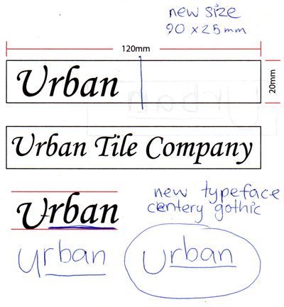
Posted: Friday,18th March, 2011 Filed under: freelance, graphic design, photography, typography | Tags: blue, client, final, freelance, graphic design, green, illustrator, in situ, original, pen-to-paper, photography, print, print broking, purple, rough, sticker, transparent, typography, water marked Leave a commentFreelance job for Urban Tile Company to design transparent stickers for boards with which they display tiles in their show room. This job is for 50 stickers in three different colours totalling 150 stickers. I also print brokered the job, learning more about sticker printing. I got the brief through email and went in to meet them when some of the details didn’t work out. Below is the pen to paper sketching alongside the rough done in accordance to the brief:
Once the size of the sticker and the typeface and its treatment was selected I could go ahead and design the artwork and get quotes for printing. The actual artwork took half an hour to do. Below are the three stickers:
With the artwork approved and the print quote accepted the artwork was sent off for printing in the format the printer preferred. (PDF with all three stickers on one page with trim marks for each sticker) I strongly suggested to the client that the stickers be individually cut by the printer for ease of use and to save their time. Below are the three bundles I delivered to my client:
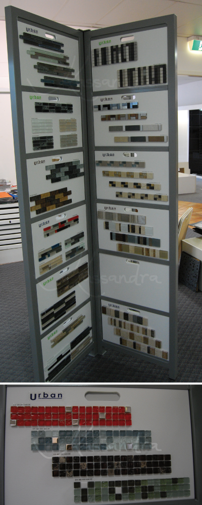
When I was delivering the product I asked the client if I could come back in two weeks to photograph the stickers in situ. I was granted permission to do not only this but to put this job on my website. Below are the stickers on the display board in Urban Tile Company’s show room:
This was a great job to do and I was very happy to have such a happy client.
The Dreaming
Posted: Friday,2nd July, 2010 Filed under: festival, photography, typography | Tags: #990066, compile, creating, documenting work, festival, original, painting, photography, QFF, sign making, The Dreaming, typography, water marked Leave a commentThe Dreaming was amazing. (The Dreaming is “Australia’s international indigenous festival”. It is held at Woodfordia by the Queensland Folk Federation – the same people who organise Woodford Folk Festival and The Planting.) This year The Dreaming was the 11-14th of June (in the middle of winter which is a change from the summer festivals).
I have already mentioned that I was making signs for The Dreaming festival.
Being a part of the set up crew for a festival is amazing. The “family” atmosphere is much more profound. It was amazing seeing how everyone in the set up crew had their small job to do over the week and by the end of the week there is a festival site ready to go and then the patrons arrive and it is festival time. Being a part of that inspired awe. It was most enjoyable getting fed three meals a day for a week – in exchange for our hard work (apart from most of the set up crew are not morning people and breakfast at 6:30-7:30am is a little too early for us).
So in the “signology” department – the department who make the signs – we um, make signs. Different departments ask for a sign and we do the lettering and paint them. As boring as it is painting between the lines it is still such a great feeling painting all day every day for a week with other like-minded people (sitting near a gas heater was a bonus – you see the heater is for the paint to dry). We all had a blast – it hardly seemed like work at all. I did enjoy myself but I find the Visual Arts (VisArts) department more creatively stimulating. I am still glad that I got to experience Signology.
Below are two types of signs that are created – general/traffic signs and (very large – 6 to 8 foot long) venue signs. In the images I have explained what I did for the signs – I ended up just doing lettering on some signs and other people (namely Jen) painted the letters. There are other signs where I was allowed to be a little creative (with glitter as well) and others where I had full creative freedom to make what I wanted.
Something that was instilled in me at university was documenting my work as I went. I understand the merit of this – those first few steps in creating something will be lost forever if you do not document them. The image below is some photographs taken while I was creating the signs.
Overall the experience inspired awe. There was an amazing atmosphere around the festival that I have never experienced before and you must experience it for yourself. The opening ceremony was amazing – I felt so privileged to watch so many indigenous groups perform for us. The other experience I have not had at either Woodford Folk Festival or The Planting festival was – I spent more time with my new friends at camp sites than I did in the festival. It was go great to catch up with everyone I have met at the other festivals. My shameful moment was running around to all the galleries as they were shutting – I made two of the gallery’s signs and didn’t look at the art over the four days – better late then never I guess. The last night, as per the tradition, I donned my red frock and went for a pub crawl, albeit alone, it was still a fun tradition to be a part of.
Until next Dreaming…
Painting for Harry
Posted: Saturday,19th June, 2010 Filed under: photography | Tags: art, client, cyan, detail, fibonacci, original, paint drips, painting, photography, plan, spray paint, water marked, yellow Leave a commentHarry asked me to paint, well some paintings, for the living room in his new townhouse. Upon spending a few evenings in this living room I realised that the red couches in this room seemed to appear very brown due to all the brown furniture. Harry said he would prefer two panels minimum and that the should be able to work however he needed them to on the wall – he even said “at crazy diagonals if I choose to”.
I started to plan. I realised I wanted yellow and blue/cyan to be the main two colours across the two panels. This is so the red couches stand out a little more as they (paintings and couches) form the primary colours (when painting). The other thing I looked into was using fibonacci numbers so that the panels would be pleasing to the eye. I wanted to experiment with spraypainting and creating drip work on canvass (something I have not done yet).
The two panels are called:
Designed to make Harry’s “red” couches stand out – Panel A and
Designed to make Harry’s “red” couches stand out – Panel B
Before I gave these to Harry I decided to photograph them (of course) but mostly in order to show how many ways the panels really can be placed on a wall – and I only spent two minutes thinking of ways while photographing…
I noticed how easy this would be to do with any colour that someone required (favourite colours, sports team colours, go with interior decoration etc) and once I started to show these to people they agreed at how well this custom art/design would sell for – if you are interested in having me paint you a set leave a comment and I will contact you.
Woollen … thing
Posted: Thursday,15th April, 2010 Filed under: MiSC, recycling | Tags: black, blue, graphic design, hand made, illustrator, information graphics, Kassandra design signature typeface, line drawing, photography, project, purple, recycling, sticks, water marked, wool Leave a commentI felt like making something with my hands. I remember making these woollen things as a child – on a much smaller scale with paddle pop sticks. To begin I went into my backyard to find a couple of good sized sticks. Then I went through my mum’s wool collection and found rements of wool to use. Then I started securing the sticks and looping the wool around the sticks, over and over again until I finished. I quickly made an information graphic (using Kassandra Designs Signature Typeface I have designed) to explain what I did.
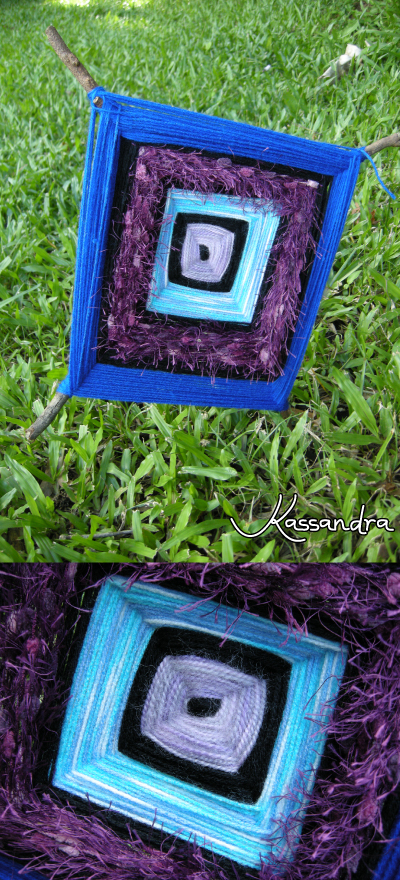
I have taken plenty of photographs of the final product. Here is two – one is how I suggest it is displayed (stuck in the ground) and a close up of the centre.
I used purples and blues and a row of black between the two. It looks great and I kept my hands busy for a few hours while I made it.


