Chester Carlson Poster – Photocopy of a photocopy
Posted: Thursday,24th March, 2016 Filed under: competition, Project | Tags: art, original, photocopy, photography, photoshop, poster, print Leave a commentObviously inspired by the work of Andy Warhol. This is Chester Carlson (the guy who invented “electro photography” AKA the photocopy. I call it Photocopy of a Photocopy. I made this for the PrintEx11 poster competition.

etsy sale: Fragments of Urban Typography
Posted: Saturday,18th January, 2014 Filed under: photography, typography | Tags: etsy, poster, sale, urban typography Leave a comment


“Proliferation of Digital Typeface in the Urban Environment”
Fragments of Urban Typography is available to purchase from Etsy.com
puppies for sale poster
Posted: Friday,20th November, 2009 Filed under: graphic design, photography, typography | Tags: dog, finishing techniques, graphic design, heirarchy, illustrator, layout, Mad1, photography, poster, typography Leave a commentI was recently asked to design a poster to sell Mad1’s puppies. These are adorable mini-foxies. After taking around 200 photographs and getting about 10 useful photographs the old saying that photographers should not work with animals has been proven once again! I was designing with the idea that I wanted a “standard” community message board poster but with a more appropriate visual heirarchy. I am tired of seeing for sale posters with the largest element being the words “for sale”! So here is the poster:

mini foxies for sale poster
The other final touches were the names the family have been calling the puppies and the words mini foxies were included in with the phone number. (I have grabbed a phone number off a poster like this but when I got home I totally forgot why I grabbed the number). I also finished off the poster by trimming along the vertical lines between the phone numbers and also perforating the horizonal line making it super easy to tear away the phone number. So far (one week later) one puppy has been sold!
Semi-Permanent Submission
Posted: Wednesday,22nd July, 2009 Filed under: digital illustration, graphic design, photography, recycling, typography | Tags: conversion, graphic design, illustrator, layers, original, photography, photoshop, poster, recycling, remake, semi-permanent, submission, typography, vector illustration 2 Comments17th July 2009
SEMI-PERMANENT SUBMISSION
After being inspired by the first 2009 semi-permanent book that DesignIsKinky released I have submitted five artworks to hopefully get included. The following quote is the email I sent them.
“Hello
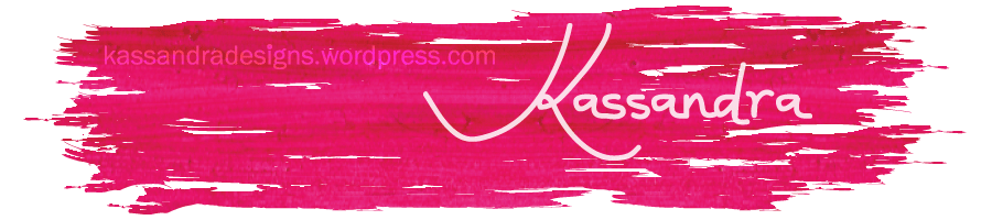
I really loved the first 2009 book and it inspired me to want to be included in a next book, hence here now is my submission. Attached is my 5 submissions for the second 2009 book, all to specified sizes. Three files are saved as 72ppi jpg. The gif file shows a stroked line which is the bounding box the rest is there as a 5mm bleed. I feel as though I must mention the last file: it is just a jpg but the actual design has been printed A1, mounted and exhibited at the University of the Sunshine Coast Art Gallery in June-July 2009 (student exhibit) and will also be exhibited in a different show in Gympie in October.My name is: Kassandra Bowers
Website: https://kassandradesigns.wordpress.comThanks for looking at my designs.”
#1

Air Brush of myself - I am aiming for doll like
This is me having a go at air brushing to the extreme but keeping in touch with reality. I have added nail polish, eye shadow and lipstick. This contains an skin texture brush from keepwaiting.
#2

a photograph with a caption saying its unedited
This is a photograph of a flower that has been composed so that the pollen is on the top left hand rule of third intersection. The image is unedited except the text stating it is Fig 1 and that it is unedited. The camera lens is literally inside the flower.
#3

"Proliferation of Digital Typeface in the Urban Environment"
This is my final A1 poster for ADN214: Visual Identity and Exhibition Design. There is more information about it at this page: Urban Typography by Kassandra Bowers. This is the submission mentioned earlier as being exhibited in an art gallery.
#4

FINAL: something for semi permanent
This is something that I created especially for the book (the other things are all adapted from somewhere else). The stuff outside of the stroked line is the bleed. The fun thing about keeping a blog is seeing things connect as: something for semi-permanent has already been changed since its original blog entry.
#5

commercialism's younger brother: development (ISM back cover)
This was the back cover for the ISM (Independent Student Magazine from the University of the Sunshine Coast) I worked on page layout and graphic design for the COMMERCIALISM issue. This was the back cover that I made from photographs I took in 2005. I was surprised after I got back to the Sunshine Coast after being in Darwin for 13 months to find that these patches of grass are now covered in concrete and structures. This has been edited since the original back cover. I sadly didn’t pick up on a typo and 10 000 copies were sent out with the 2005 saying 2008 (which didn’t make sense and was picked up on by a few of my university friends).
hugo boss competition
Posted: Sunday,12th July, 2009 Filed under: competition, graphic design, recycling | Tags: architecture, competition, compile, cut and paste, generator, graphic design, greyscale, layers, layout, line drawing, logo, pen-to-paper, poster, project, screenshot, typography, web images, worldwide Leave a comment11 July 2009
I decided to use “the generator” to make three different entries into the competition. When scrolling through I realised that there was actually text for the city Brisbane so I could not resist but put it on one of the advertisements. The category for the final round is “simply city” so the following three designs were my competition entries.

Hugo Boss entry 1: urban planet
Using the bottle only on a gradient background and the tag line urban planet: simple and city.

Hugo Boss entry 2: Urban planet Brisbane
Black and white only with hustle and bustle of the streets of “Brisbane” complete with the name Brisbane, the confusing map of streets (similar to Brisbane) in the shape of the bottle a requirement and the tag line “urban planet” to anchor the visual message with text.

Hugo Boss entry 3: urban thrills live it up
A very different approach indeed. The background is created from a very enlarged surfboard and the rest of the elements: city, man, bottle, text and flags are all minimal colour scribbled elements which ties all in visually. There is a very vivid and lively colour palette which ties in the text: live it up.
These designs have all been put up on the site and the disclaimer did state that not all were going to be put up on the site. Maybe the three links will work but they may not correspond to the order on this page.
