Wedding Book
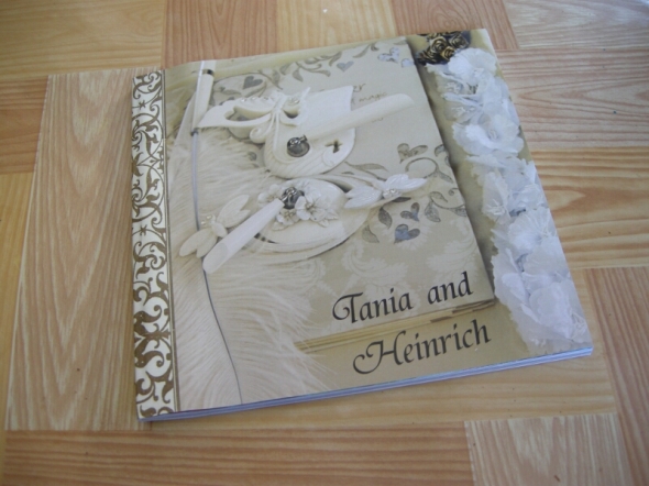
Posted: Thursday,5th January, 2012 Filed under: freelance, graphic design, photography, Project, typography | Tags: graphic design, indesign, layout, photo book, photography, photoshop, scrapbook, wedding book Leave a commentI was very happy to hear that two good friends of mine were getting married and even more honoured to be the photographer at their wedding. The day went very well and the photographs turned out quite well despite being in the harsh Queensland afternoon sun.
As an extra special present to my two friends, and their family, I took the best photographs and created a photobook for them.
I had a lot of fun taking the photographs and lots of fun creating the book but the most fun was the reaction of the new bride, she loved them. I have already been told that the people she has shown it to have really liked that I captured the feeling from the day within the book – my aim exactly!
Flower Tag design
Posted: Friday,18th March, 2011 Filed under: graphic design, photography, Project, typography | Tags: clipping mask, compile, creating, cut, flower tag, flowers, graphic design, green, illustrator, in situ, Kassandra, laminate, layers, magenta, mask, orange, original, photography, pink, print, product, purple, red, remake, template, typography, water marked, white, yellow Leave a commentI recently bought 10 different types of flowers and pots to plant them in so I could add some colour to my backyard. After planting I was very upset at how crappy the flower tags were. I will not show the originals because they were that bad. They were all red, had a crazy huge logo and the text for each flower was small, upper case and white on red. These tags were more about the company who grew them than about the individual flowers. I had to change this – design tags that were all about the flowers and not me.
As a graphic designer and photographer I started with photographing my new flowers. After getting the photographs off my camera I had to select all the best photographs, about 10 minutes. I spent about 15 minutes getting a rough template together that has the shape, clipping mask all ready to go and the text in place. Using the ‘template’ and the selected photographs, typing in the name, changing colours etc took about 20 minutes for all the tags. So basically I made 10 flower tags in about 45 minutes. Below is 8 of the 10 tags:
Once I printed them all I cut them out and laminated them and then cut them out (again). Below are the flower tags as they are displayed in the pots:
I have already had some friends and family mistake these flower tags for being the tags that came with the flowers since they are so well designed and professional looking. I smile because this is what I do.
Urban Tile Company Stickers
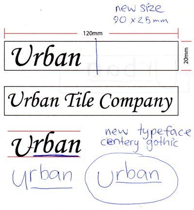
Posted: Friday,18th March, 2011 Filed under: freelance, graphic design, photography, typography | Tags: blue, client, final, freelance, graphic design, green, illustrator, in situ, original, pen-to-paper, photography, print, print broking, purple, rough, sticker, transparent, typography, water marked Leave a commentFreelance job for Urban Tile Company to design transparent stickers for boards with which they display tiles in their show room. This job is for 50 stickers in three different colours totalling 150 stickers. I also print brokered the job, learning more about sticker printing. I got the brief through email and went in to meet them when some of the details didn’t work out. Below is the pen to paper sketching alongside the rough done in accordance to the brief:
Once the size of the sticker and the typeface and its treatment was selected I could go ahead and design the artwork and get quotes for printing. The actual artwork took half an hour to do. Below are the three stickers:
With the artwork approved and the print quote accepted the artwork was sent off for printing in the format the printer preferred. (PDF with all three stickers on one page with trim marks for each sticker) I strongly suggested to the client that the stickers be individually cut by the printer for ease of use and to save their time. Below are the three bundles I delivered to my client:
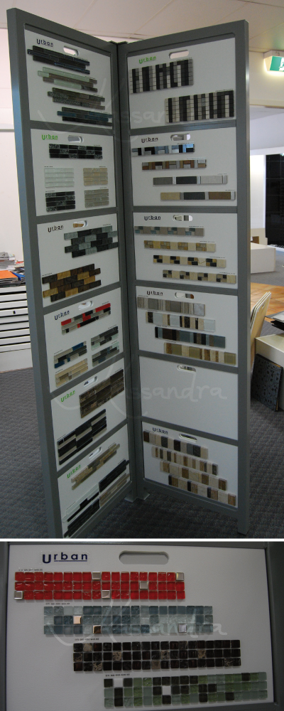
When I was delivering the product I asked the client if I could come back in two weeks to photograph the stickers in situ. I was granted permission to do not only this but to put this job on my website. Below are the stickers on the display board in Urban Tile Company’s show room:
This was a great job to do and I was very happy to have such a happy client.
Gold Coast Big Day Out 2011 – sign design
Posted: Friday,11th March, 2011 Filed under: festival, graphic design, photography, typography | Tags: big day out, compile, festival, graphic design, in situ, original, painting, photography, sign, touch up, typography Leave a commentI worked at the Gold Coast Big Day Out – making signs.
To start my job I did inventory:
The biggest job was 10 new signs that said “Surf the ocean not the crowd” below is a visual of how this job was done:
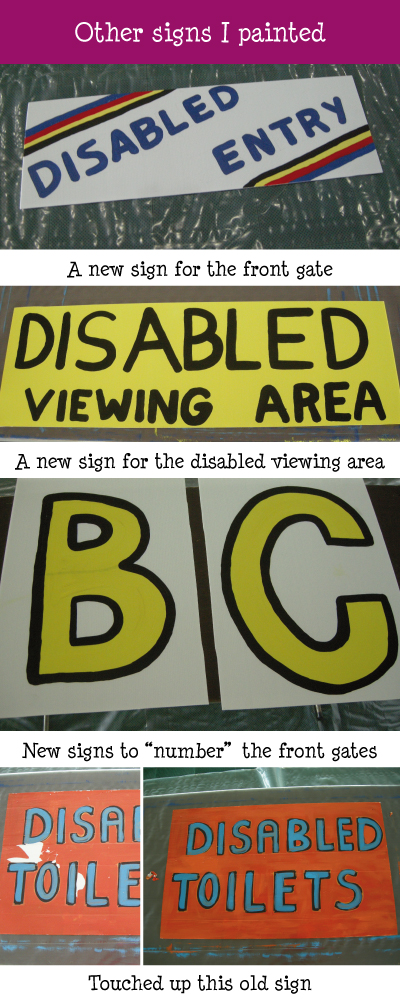
I worked on some other signs too:
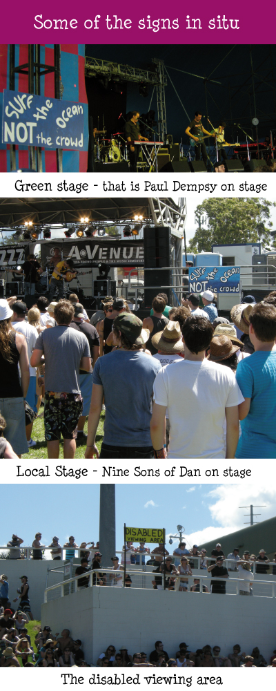
While I was at the festival I tried to hunt down the signs that I made – I walked through a different entrance to the ones that I made signs for and as we were locked in I unfortunately did not get to take photographs of all my signs in situ. I did however find these three in situ:
I had a great time working with the set up crew and it was great to see this festival come together over the three days that I worked on the set up.

